True art cross-pollinates. It sees its branches freely weaving in, through, and out of each other.
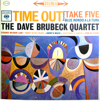
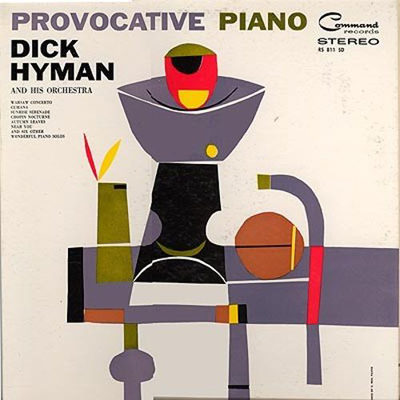
Born in Hawaii, S. Neil Fujita was a prolific graphic artist who designed unique, distinctive album covers and book jackets that you may very well have seen before. His artistry can be seen on the album covers of greats like Miles Davis’s ‘Round About Midnight, Charles Mingus’s Mingus Ah Um, the Dave Brubeck Quartet’s Time Out and Dick Hyman and His Orchestra’s Provocative Piano, as well as novels by Truman Capote and Mario Puzo. The artwork looked like so many murals on downtown towers that became so internationally prevalent in 1970s architecture.
I do not know what strikes me first when I see the art or listen to the music. The combination of the music and graphic design is so arresting and stimulating. The tunes flow just like the lines of the illustrations, a bold modern direction with colours and shapes, swirls and loops, presented as collective abstractions that were so contemporary in their time. Just as the music swings and dances with syncopation, so do the strokes of the pen and brush in Fujita’s design work. To borrow descriptive language from one art form and apply it to another is the easiest way for me to describe the experience — it is syncopated illustration.
Fujita began working for Columbia Records in 1954. There, he was tasked with building a design department to follow the mastery of Alex Steinweiss, the record label’s previous legendary designer. Steinweiss revolutionized the cover art for what was then still a very new format — the LP. Columbia was in competition with Blue Note Records, and that competition even extended to album artwork.
In 1963, Fujita joined a PR firm called Ruder & Finn. It was there that his design evolved even further within a division that came to be known as Ruder, Finn & Fujita, and later Fujita Design. He then created some of his best-known and iconic design work on book covers including In Cold Blood and The Godfather.
Gone are the days when you could easily get lost in a place of imagination and wonder while contemplating an album cover and reading liner notes. It was often a free-falling experience, filled with dynamics. The “eye play” from the artwork and the “ear play” from the music was an exciting binary adventure of the senses. It was an early form of multimedia in your hands and on the turntable nearby.
To this day, when I look at the Fujita album covers, I instantly hear the music. And when I hear the music, I see the album covers. The memory is sparked equally, and both sensory experiences are as vivid. The beautiful book covers do almost the same, as I remember passages and see the scenes. It is an almost synesthetic experience, speaking out loudly, brightly and clearly to the treasure of the brilliant artistry of all the musicians and designers involved. It is some of the coolest art perfectly married to some of the coolest music ever.


